Dan Perri isn’t a name you see, as they say, above a movie’s title. That’s because he designed the title.
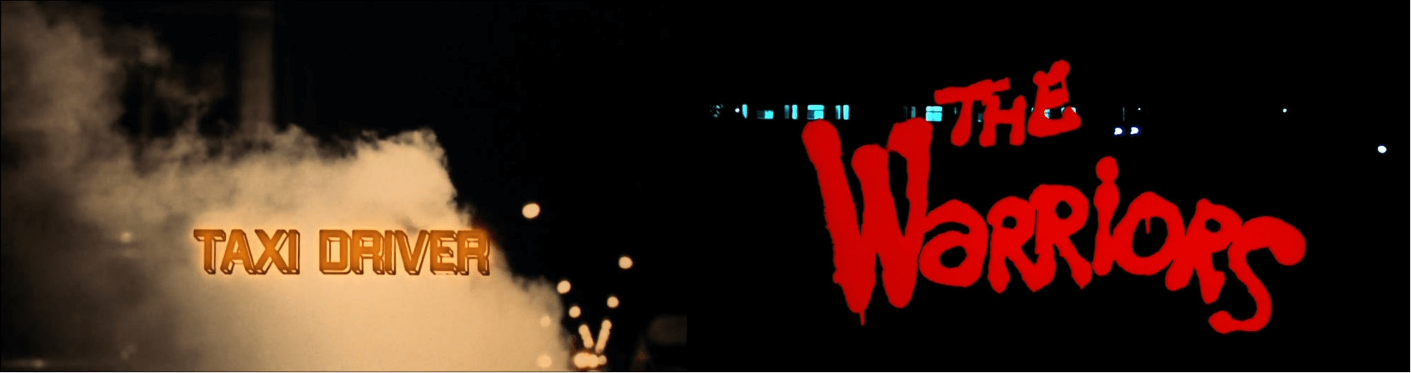
In a monumental five-decade career that began with The Exorcist, Perri created more than 200 titles for some of the biggest, most important movies ever made: A Nightmare on Elm Street, The Warriors, Close Encounters of the Third Kind, Bull Durham, There Will Be Blood, All the President’s Men, Taxi Driver. Oh, and the opening crawl at the start of Star Wars movies? Yeah, he’s responsible for that, too.
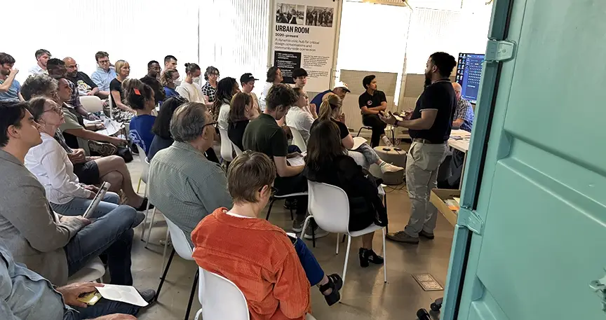
Perri is one of the most underappreciated creators in movie history. But the Museum of the Moving Image, in Astoria, is helping change that narrative with the small but impressive retrospective, Dan Perri and the Art of the Title Sequence, on view through January 1.
Good title design can often feel inevitable — it can’t be anything but this. But that sense of natural emergence betrays the work and creativity poured into each one, none the same as the last. And as the exhibition of process materials, ephemera, and video loop of title sequences demonstrates, with the exception of Saul Bass, the legendary designer of film titles like Psycho and North by Northwest, there’s no one more important to the success of title design than Dan Perri.
Actually, it’s not much of a contest. Perri has clearly overtaken his old mentor. Try imagining pop culture — and movies — without his work. It’s impossible.
The 77-year-old Perri recently spoke with the Star-Revue about his career, what he learned from Saul Bass, and where title design is today. Our conversation has been edited for length and clarity.
You probably hear this all the time, but I didn’t quite appreciate, until going through the exhibit, just how important you and your work are to not only movies but my life as a moviegoer.
It’s kind of you to say that. I have heard that occasionally; it always amazes me. I just don’t think about it in that way. But, certainly, you never realize how things that might have been done by one person influenced you until a day comes where you see all that work in one place. A phenomenon similar to that has happened to me quite a number of times when I’ve met people who somehow understand I did Star Wars. They stop whatever they’re doing and tell me everything that happened the day they saw it: where they were, who they were with, what theater it was, what time of day, what day of the week — all these things that are now embedded in their memory because of the experience. I was only a small part of that; I designed the first moments of the film, then the film took over and impacted them so strongly. But because my work is part of that memory and impact, it’s so important to them that they have this moment to tell the person who did the work how it affected them. It’s quite a phenomenon when it happens. You can see their eyes light up and something goes off in their head and they just have to tell you all about it.
That opening crawl is indelible. But so is a lot of your work. The Warriors and that dripping graffiti logo and credits rushing at us through the subway — there’s no other way that movie can start. Your work is obviously plugged into the experience of what it means to tell a story, but it also seems very aware of what it means to watch a movie.
It’s interesting you say that. I’m certainly a big moviegoer. I love film. I love motion and the experience of watching a film, and to get the opportunity, as I have had, of contributing to so many films, it’s just more of a thrill for me. I’m still working with new groups of people, and I’m excited about the opportunity to contribute to their film. So it just continues to go on. And that experience is so wonderful and important to me.
Much of your work is optical title design, but now titles are done digitally. How do optical and digital title design differ?
Before digital came along, the only way to put something on the screen was working with an optical camera and lenses and photographing title elements and then superimposing them over backgrounds or artwork or whatever it might be. That was done optically, where this camera would photograph the title elements first, on a separate piece of film, and then combine them, which is called bipacking — where the new negative title elements physically touch each other — on this optical camera with a special attachment called an aerial head, which allows for this compositing effect to be done. So all the years of my career before digital, I was working with optical effects and I had to know what it could do. It’s only a tool with which you combine these designs and put them on film.
When digital came along, it simply replaced the optical method of combining and putting designs on film. I had to learn what it could do — and it can do a lot more. So that affected my approach to imagining a title for a particular film. It’s still only a tool, but it’s a much more effective tool. I can do many more things that I can imagine that I was not able to do. But even then there were limitations when I first began working digitally. Originally, when digital was new, it was too expensive. But it has become affordable, and there are digital artists all over the world that have their own computer and that’s all they need. I speak to design classes and festivals all over the world, and students always want to know what it was like to do something optically compared to the simplicity of doing it digitally. So it has kind of circled around again, where some filmmakers want the effects that physical film brings to the work.
When a director asks you to do something on film, are you working optically? Doing digital to film?
It first happened on [Luca Guadagnino’s 2018 remake of] Suspiria. The director had shot his film on 35mm, and he desperately wanted me to finish my design work on film, as well. So I sought out my old friends and associates in the optical world, the cameramen and lineup people and other supervisors and so on. I found that some had died, others were retired, and there was no one really working in the field because the optical effects world has vanished. But in addition to that, there were no cameras around and no special stock. Eastman Kodak had created a high-contrast black-and-white stock that was used to photograph the title elements, which you then would use to composite the title and backgrounds, and there were filters and so on that had to be used. All of it was unavailable. So I had to create a formula whereby I composited the titles digitally, but I denigrated the quality so that when the titles were superimposed over the film backgrounds we were using they were in the same world. If you put a sharp, clean digital title over this relatively soft, grainy, filmed background, it would just stand out and look wrong. So I devised a method to denigrate the titles and then we would composite it, and it looked like it should have looked. I’ve been asked to do that again on this film that I’m working on — it’s a big movie, out by the end of the year — and we’re facing the same situation, which is thrilling, but also frightening. We might not be able to execute it because of the lack of the necessary equipment or materials that would be necessary. So that’s a challenge that has come because of the change in the industry and digital coming along.
That filmmakers come to you as a kind of old master of optical titles calls to mind your mentor Saul Bass and the way designers of your generation looked to him for inspiration. Now people are coming to you like you’re the new Saul Bass.
It seems like I am, yes. I’m regarded that way by virtue of time passing and his leaving us and my work cumulatively becoming a large part of the title design world. So I guess I assume that mantle by default and nothing else. I certainly admired him and wanted to be like him, and I’m happy that I’m looked upon that way. That’s part of why I speak to so many schools and designers and motion design people — I want to share what I’ve done. I think I’m obligated to do that, to share what I know and share what I’ve done. There seems to be lots of interest in my doing that, so I’m continuing to do it.
What was it that you admired about him?
His strong graphic vision. He was able to visualize simple images in such a way and boil them down to this wonderfully clean and powerful moment, usually in silhouette or some kind of graphic interpretation. It was always just so right, so powerful. If you looked at the film and you studied it, you realized that he found just the right moment — that frame or feeling that he drew from it. And his designs were always just so economical and perfect for the moment. It was magical. I always admired that. I studied it and wanted to be like him.
You’ve said you think of yourself as a graphic designer and a filmmaker. So many of your title sequences can almost stand alone. The openings of Taxi Driver, The Warriors, Wall Street, Nashville — they’re like short films. Do you approach a title sequence with that in mind? How does your filmmaker side play with your designer side?
I don’t approach it consciously with the intention of making it a sequence unto itself. But I usually will get involved with some concept that is a little story that you’re telling, whether you’re introducing the character or you’re setting the scene, the location, or the era or the particular, unique aspects of the story. You’re examining that, you’re bringing it to the viewer to allow them to get into the film, to learn more about it so by the time the story starts they know about the character or the car he drives or the house he lives in, whatever it might be. So the film benefits by having that introduction that contains the titles. That’s it. There’s a wholeness to it, a beginning, a middle and an end. I want to wrap it up so it comes to an end: the story is told, the introduction is completed, and now the film begins. Sometimes you actually fade out and then cut to the first shot or fade in, like on Raging Bull where the titles end and go to black and then come up with the first shot. But it’s not conscious on my part. It’s more of the way I think and how I, as a storyteller — you tell a story and it ends; it doesn’t just hang there, in midair. It’s just the way I approach it naturally, and it seems to fit well with what I’m doing in servicing the film.

The movie landscape is very different today than when you started. Hollywood is dominated by franchises with established and instantly recognizable visual identities, and it sometimes seems like the title sequence is a dying art. Is that a misreading of things?
It’s true, it does seem that way. Although there are probably many times as many films made now as there were years ago. But there’s so many viewpoints and so many different needs for films, niche films and different kinds of films, genre films, for different uses. And there are certainly enough new designers around that could provide designs for many films.
There was a time several years ago that, for some reason, directors started not having titles at the beginning of the film, except for the title, and all the other titles were at the end of the film. I guess the thinking was that the modern viewer has a shorter attention span because of computers and the internet and so on, they want gratification immediately. If you don’t give them something to look at, they’re going to literally change the channel or go to the next internet site or whatever it might be. They wanted to excite them immediately and constantly so that they will continue to watch the film. But that happens more on television because you have this plethora of channels and material to watch. You can easily go to the next one if you’re not satisfied instantaneously. But I work in the feature world where a person has paid money to come in and sit down and watch the movie. They’re not going to leave — they’ve already paid their money, but they might check out mentally, look at their phone, or whatever. So I’m conscious of that, and I want to give them something to look at to both satisfy their need to see something changing and different but at the same time delivering more information about the story I’m telling in the titles. I’ve had to accommodate that and become aware of it. It’s part of the reality of the world I’m working in and the designs I’m creating for this specific film.
But there’s also this recurring kind of throwback where more and more people are interested in the past cinematically. More than one generation of younger people are starting to recognize and notice and appreciate what happened before them. And I’m part of that. People seem to appreciate me and what I’ve done. So I’m pleased that I’m still here and I’m able to share with them and they’re appreciating it.
Dan Perri and the Art of the Title Sequence is on view at the Museum of the Moving Image, 36-01 35 Ave in Astoria, through January 1. Perri will be at the museum on November 13 for a discussion following a screening of Taxi Driver. Find more information online at movingimage.us.
Author
Discover more from Red Hook Star-Revue
Subscribe to get the latest posts sent to your email.